
Ian Pons Jewell, a featured regular here at DN has produced yet another captivating piece of short cinema. This time, in the form of an advert for the Canadian Olympic team. Ian pays homage to fine art and renaissance paintings to celebrate the esteem and power of these athletes’ stories to create powerful and meaningful images. I spoke to Ian about his creative choices in selecting how to represent these remarkable individuals.
Where did the idea for Be Olympic come from and how did it evolve?
The brief had a strong overall concept of showing these athletes within a sort of renaissance painting styled scene. We had their backstories to work from, and some other pointers that were important to show. Each frame has it’s own meaning and backstory. My overall approach was to create these incredibly beautiful slow moving scenes, with enough detail that you can you look at one image for that amount of time. Slow motion can be hypnotic but it can also screw you.
It was vital that these scenes had enough depth, enough character, enough story, that it would bring you in and communicate viscerally. It’s been wonderful to see such a great reaction to it, no one’s really asked what it means, why there’s a bike crash, who they are. Which is interesting, because each story is so specific to each Canadian athlete I wasn’t sure it would get as good a reaction outside of people who know them.
Slow motion can be hypnotic but it can also screw you.
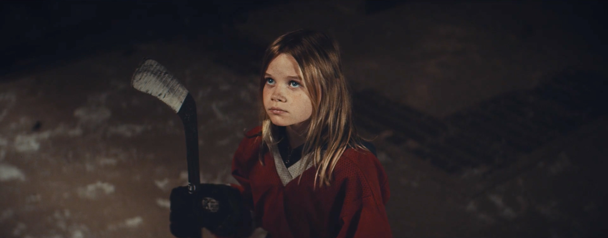
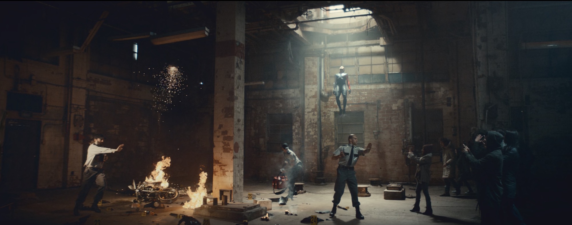
The first scene for example features speed skater Denny Morrison. He’d been in a terrible bike accident which he somehow recovered from and went on to skate without problem. He had a collision so hard it flipped the car he crashed into. He just suffered a broken leg and femur, pretty miraculous. So I wrote his scene with this visualisation of him rising from the accident in his speed skating gear. Overcoming this event and going on to win a medal. I loved the idea of him looking like a super hero too. It had a religious angle but also with a contemporary superhero suit look.
The people surrounding the crash taking photos are indicative of all the criticism he received from people and the press, as there were questions on why he was going so fast. I then worked the police characters in the scene to have something about them that’s slightly off. To me, it looks like they’ve stolen the uniforms and are impersonating police officers, that was the backstory we created to get that look. Questionable authority.
My favourite scene is Mark McMorris lying in the arms of a nurse. It was totally inspired by Michelangelo’s Pietà. Mark suffered a near fatal accident a year before his medal win. So I had these suspicious doctor characters surrounding him to try and get a sense of this nurse being the only one vying for him, the only one believing in him. The idea being that they’re assuming his oncoming death, to the point there’s some forensic evidence being taken off his snowboard to the side. We also framed up his eye opening moment in front of the floor drain to get this crucifix symbol behind him. Though this was removed in post in the official version unfortunately.
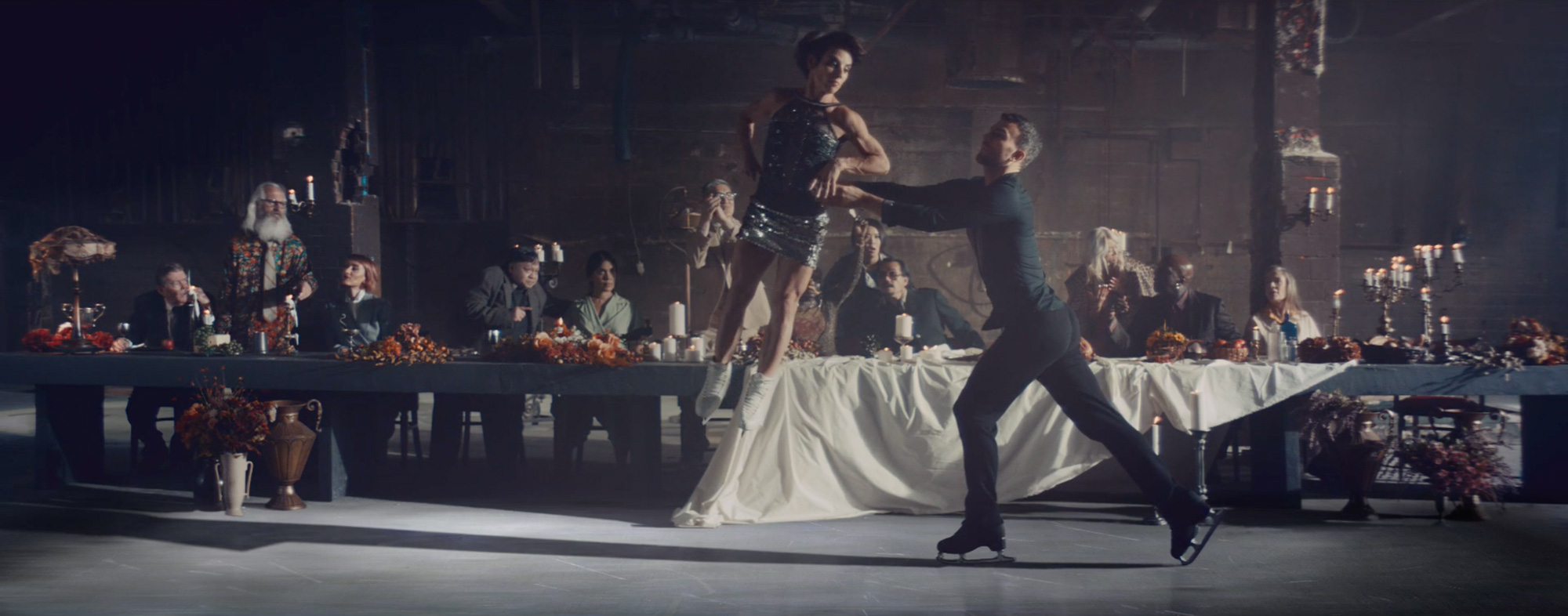
So that’s the approach I had to each scene. Working in as much detail as possible and backstory to each character. I worked closed with stylists Stacy Troke and Narian Jay to work out their identities and we would do a back and forth on who they are, what they do. Every person in the film has a story of their own. Some of the stuff we came up with is quite dark such as the hospital scene by what I liked about doing this, despite it not being obviously apparent when you watch it, was to create a further sense of them rising above all the obstacles around them. They’re everywhere. From the judges, the authorities, the establishment. Reality itself. Finally at the end the female hockey players are cast into gold statues, leaving an inspirational history for the next person to look up to and have a path to follow.
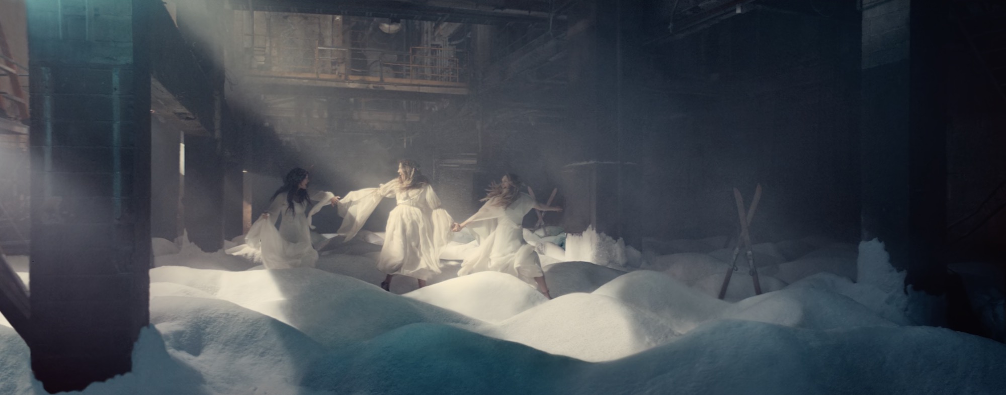
Stylistically speaking, there seems to be a heavy fine art influence on the cinematography. Were there certain pieces that were homaged? For example, the room at 0:15 reminds me of Andrei Tarkovsky’s Stalker.
Caravaggio was the key inspiration for much of it. The layout of people, the way you can feel an entire narrative based off one facial expression, the use of shadow. For the sisters, yes absolutely, Stalker became a big reference as I was struggling to work out how to show their profession. This was always a battle throughout, with pushback on the scenes often coming in the form of, “We need to show their sport”. Which I totally get. But at the same time we wanted to avoid hanging a ski lift above them. So I worked in the ski moguls into this set which created this Stalker homage.
The key for me was to try and create something timeless. This sounds a little pretentious but it’s something I am always aiming for in certain work. This was one which I didn’t want to tap into the current pop culture zeitgiest. Jay Pooley our Production Designer, and our stylists, totally nailed this, I think.
Could you talk about the use of slow motion, what do you believe the benefits of it are?
As I mentioned there are many benefits, but it can also go against you. I work a lot with slow motion and I do think it’s a technique to master like any other. You also need a DP who can use it. Mauro Chiarello is phenomenal in many ways and we both love the Phantom’s look. What it gave us was the ability to frame a scene like a painting. To work very specific detail within each frame. We could put more time and energy on this one single image, rather than spreading ourselves thin needing to get lots of coverage.
The key for me was to try and create something timeless.
1000fps meant the smallest of actions could be drawn out over all that time whilst keeping a hypnotic feel. Despite this, we were still rushing around of course and each scene has a few close ups but the wide was the main focus. Those close ups in the skating scene were shot in the final 10 minutes of our shooting schedule for example. Mauro and I ran over after switching to hand held and I’d bark nervous made-up-on-the-spot instructions to each actor whilst Mauro snapped a couple seconds of them, then onto the next working your way down the whole table. But you can’t see it’s handheld due to how slow it plays out.
What were your artistic goals for the piece?
As with any project I do, I wanted to make something as special as possible. An uncompromised piece that’s ultimately a commercial but doesn’t quite feel like one. Sometimes it works out, sometimes it doesn’t. I’ve always wanted to make something with opera too, specifically that track. To make images that could play out to such a piece was a dream come true. We even recorded it ourselves with my long time collaborator Tim Harrison who produced the recording session. The singer, Pamela Hay, is someone I wanted to work with years ago. When I wrote to her about this, I saw that our last email exchange was in 2010.
Will you be doing any more similar work soon? What are you working on currently?
I’d love to make more work like this. I’ve certainly had a much higher percentage of comedy scripts than stuff of this ilk, but I also love comedy. My personal work is probably less drawn toward comedy due to this, such as my video for Sevdaliza. I’m now working on a short film that will shoot this year. It’s an idea that wasn’t picked for a music video. I was so in love with it that I felt depressed for a month. It was like state of mourning. So I’m looking forward to digging that back out from the music video treatment grave.
