
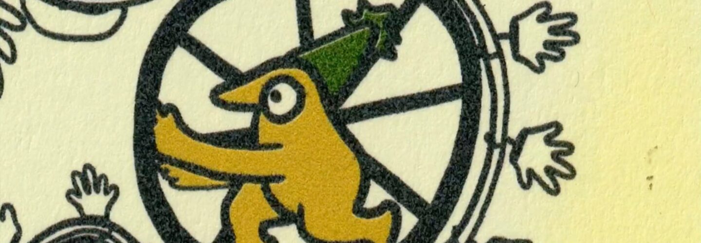
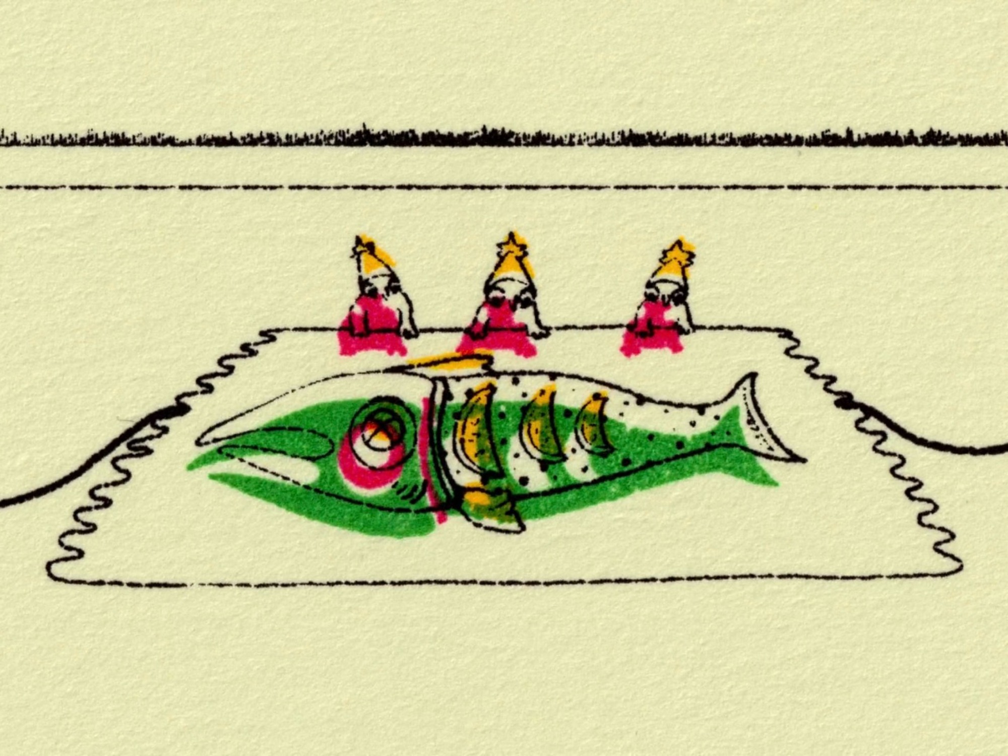
When you think about films exploring consumerism and mass production, you might expect observational documentaries or investigative journalism pieces filled with familiar images of huge factories and automated production lines. For experimental animator Kate Renshaw-Lewis, though, their exploration of the everyday objects we consume was always going to take a much more tactile and surreal route. Inspired by the mechanical, repetitive process of printed animation itself, Busy Bodies takes us inside a strange domestic factory where tiny workers operate an elaborate production line, manufacturing the mundane objects and ingredients that fill our everyday lives.
Winner of Best Animation Short at Slamdance 2026, Busy Bodies is a charming and surreal film packed with inventive craft and plenty to think about. Beneath its warm colours and absurdist humour is a meditation on the hidden labour and questionable ethics behind those everyday products we rarely stop to question. In this interview with DN, Renshaw-Lewis joins us to discuss how the film’s process shaped its narrative, the meditative quality of repetition and the joys of creating a soundtrack from lemons, vacuums and vintage synthesizers.
Hi Kate, thanks for joining us on Directors Notes to discuss your animated short Busy Bodies. I wanted to begin with the ideas behind the film. In your synopsis, you describe it as exploring the “journey of disposable objects” and the “destructive nature of the factory method supply chain”. What were you hoping to say about these ideas and why did you choose this particular story as a way of exploring them?
Hi Rob, thank you so much for including Busy Bodies. I’m very honored to join Directors Notes. Busy Bodies began with the choice of medium, which is printed animation. I wanted to tell a story that was deeply connected to the mechanical, intensive, step-by-step process of printed animation. The idea for the film came to me while I was grabbing lunch during my lunch break, and I noticed a small sticker on my pre-packaged tuna wrap that said, “made by hand”. I started wondering: Whose hand? How did they make it? Will I ever know what goes on behind the fluorescently illuminated presentation of the grocery store? I was also struck by the repetition of grocery stores, rows and rows of produce that seem to live outside the rules of seasonal availability.
Consumption has evolved at a monstrous rate, while production has grown more opaque.
I wanted to comment on the disconnect I feel between the convenience of very familiar, mundane, and disposable objects and the mysterious journey of creation and distribution they go through. We live in a time when convenience is expected at every scale. Consumption has evolved at a monstrous rate, while production has grown more opaque. I was also deeply inspired by Rube Goldberg Machines and The Natural History of the Chicken by Mark Lewis (particularly a scene where little baby chicks are carried up a metal conveyor belt and sorted through various machines).
The film imagines this bizarre domestic factory, where tiny workers operate an elaborate production line to create something as mundane as a rubber glove. How did this central concept develop and what appealed to you about using something so absurd to explore the realities of mass production and consumption?
I really think our systems of production are absurd when you break them down – very efficient, and very absurd. There’s so much engineering and process behind delivering something as simple as rubber gloves, or even something as natural as a lemon. I’m particularly interested in the production of these mundane, organic objects because their factory journeys contrast so sharply. When I think of a lemon or a fish, I don’t immediately think about all the machinery and tools used to prep and deliver them to the store.
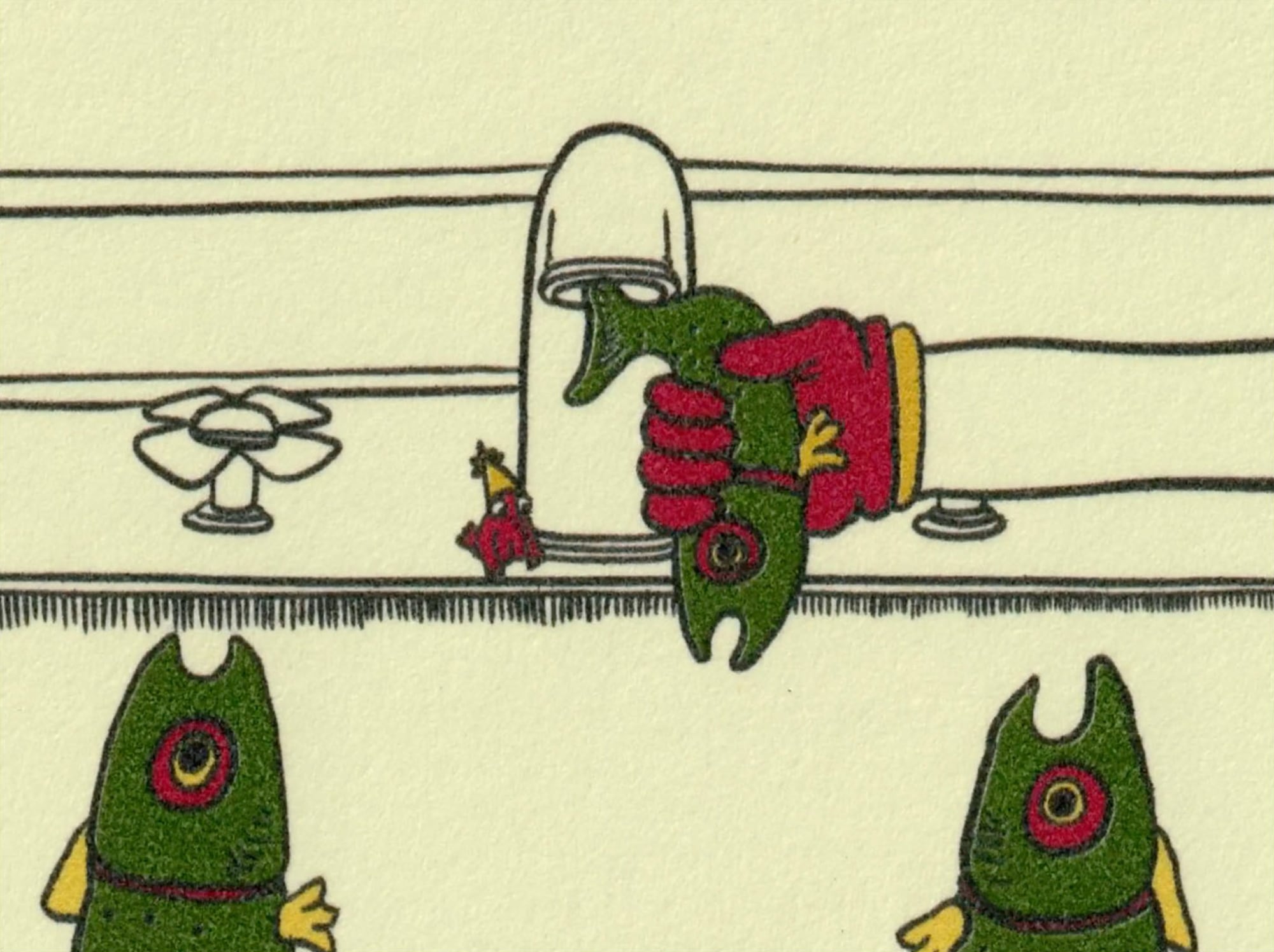
I am a huge fan of rubber gloves as an object, they also add a layer of bureaucratic protocol to the film. There is a main character that is never fully seen, just their large hands. They can’t use the sink because there are fish instead of water, so they wash their hands with lemon juice and then plop on a pair of gloves made in the cabinet under the sink. The film follows a rigid set of rules and logic that point to the accepted absurdities of modern convenience. I also set the film in a domestic space (a kitchen and backyard) because mass production feels so huge and unknown. I wanted the domesticity to make the subject more familiar and comfortable, while highlighting the mysterious element of our factory systems.
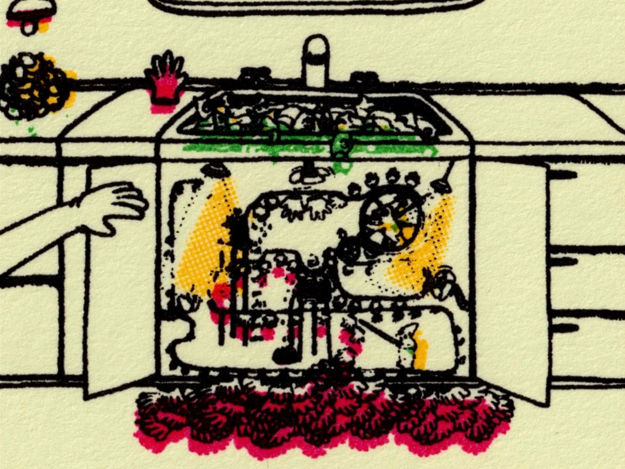
There’s a wonderful Rube Goldberg quality to the machinery, with each action triggering another in an increasingly elaborate chain of events. How did the logic of the Rube Goldberg machine connect with the themes you were exploring?
I love love love Rube Goldberg Machines, both as a visual and a concept. The logic of Rube Goldberg machines felt so important to the film because of its redundancy and delicacy. Rube Goldberg machines are intentionally overly complicated; they emphasize the process rather than the final result and they differ greatly from the mechanisms of mass production in that sense. But mass-production systems are surprisingly delicate, that delicacy has recently become apparent with supply chain issues. The visual inspiration of Rube Goldberg machines also brought levity and humor to the subject, which feels natural to animation, and highlighted the absurdity of factory production methods.
Most Popular
Your choice of animation technique – 2D hand-drawn printed animation – feels particularly well suited to the themes of your story. How did the narrative and the animation technique influence one another during development?
This was my first film where the medium came first. I was teaching printed animation classes at the time and had free access to a print studio. Many choices for the film’s visuals and narrative came from the printing process’s restrictions. The film uses a combination of inkjet printing (using individual color passes) and silk screenprinting. Screenprinting requires separate screens to be burned for individual colors, resulting in a limited color palette for the film.
The film was initially intended to be entirely screenprinted, but inkjet printing came into play because of budget and time limitations, creating a major plot point. The film switches from inkjet to screen printing just as one of the characters steps away from their role in the machine and looks out at other parts of the factory. The switch to screen printing visualizes the machine’s deterioration through investigation and identification of the factory process.
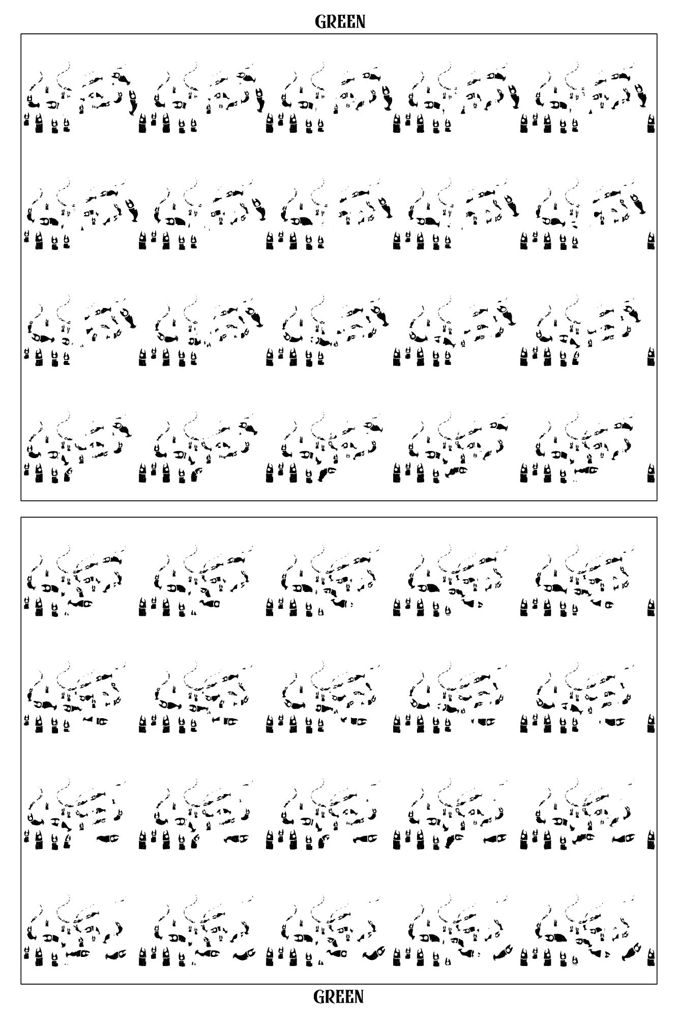
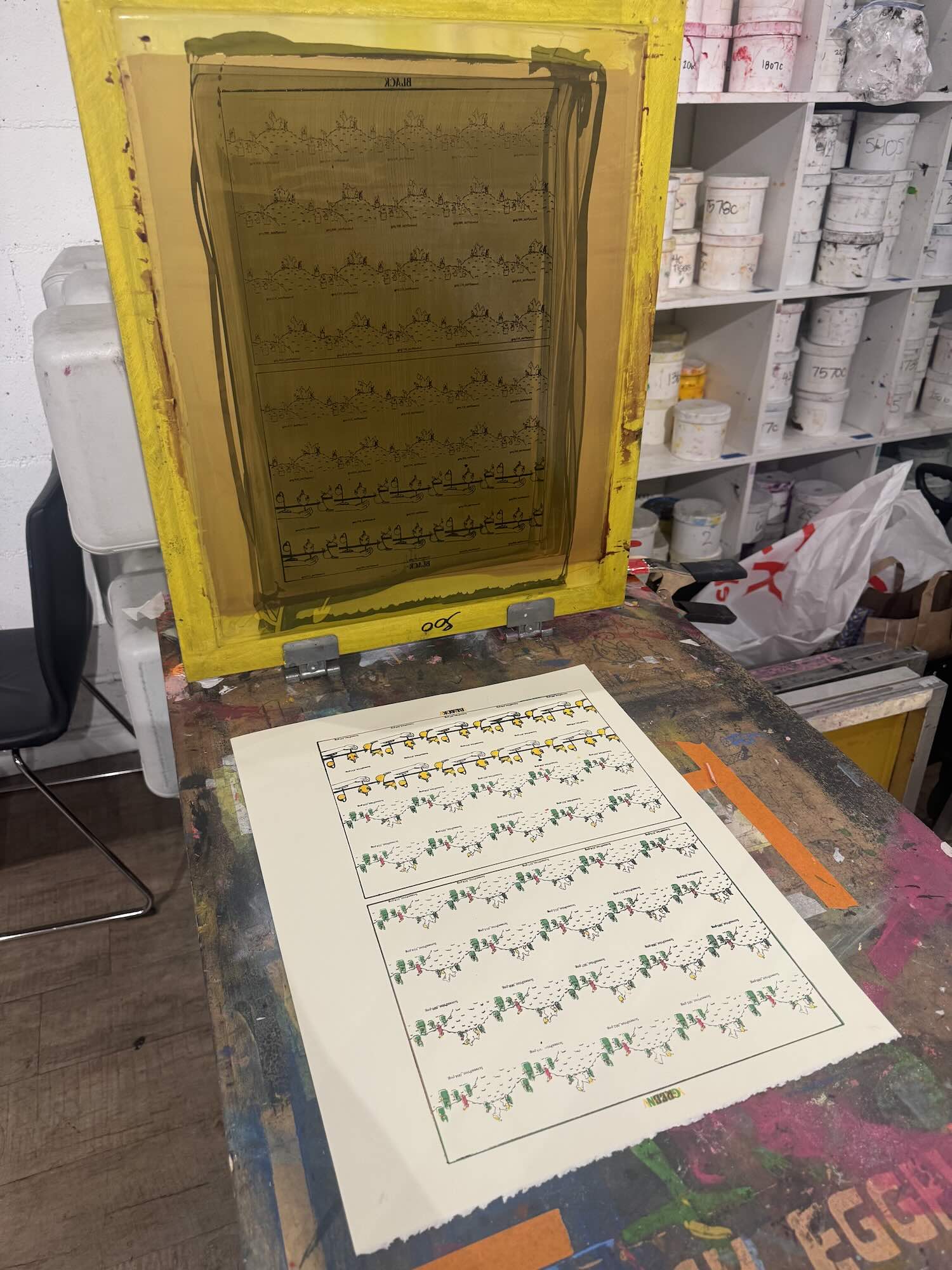
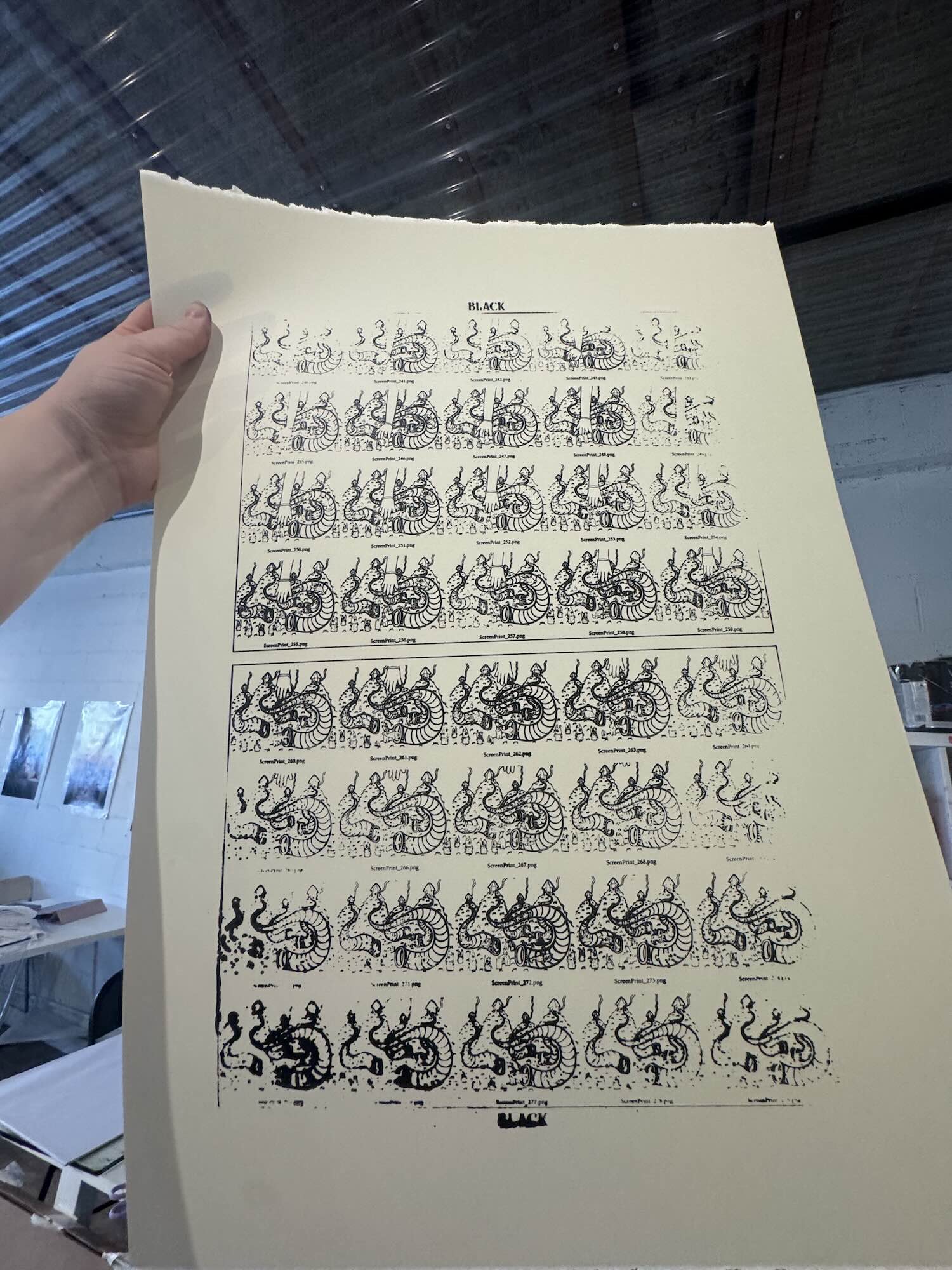
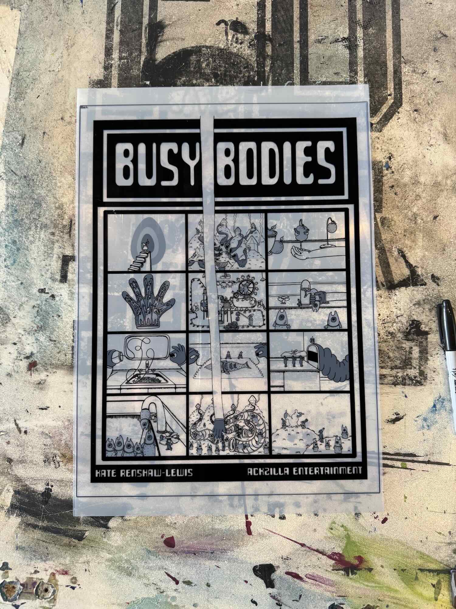
Can you take us through the production process? What does an individual frame of Busy Bodies go through before it becomes part of the finished film and how long did the animation take from those first drawings to the final edit?
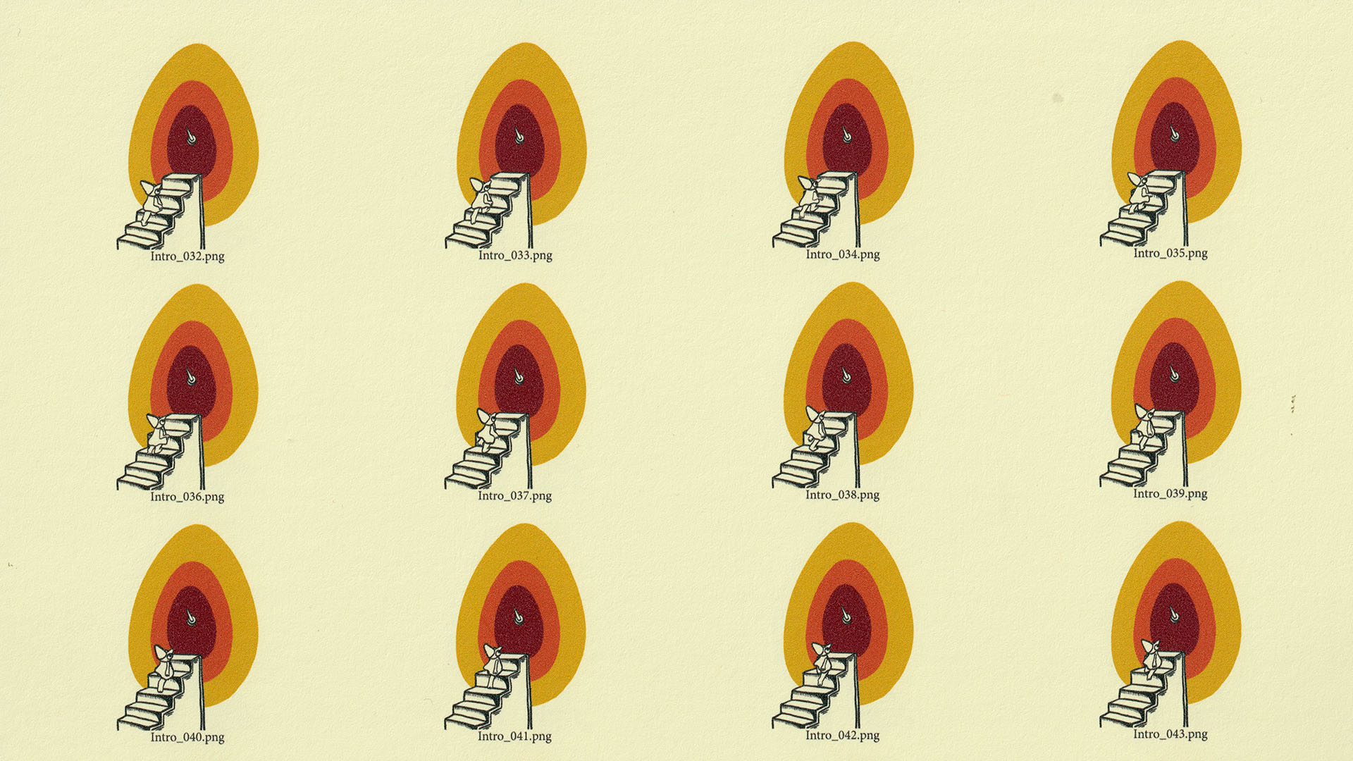
Busy Bodies was animated digitally in Photoshop, then sent to Arius Ziaee, who digitally colored the film frame by frame. I then composited the digital animation and exported image sequences separated by color. I made contact sheets from the image sequences, with multiple frames scaled down so about 20 frames could fit on the paper I printed on. Scenes that were going to be screen printed were then sent to a printing house for printed transparent sheets. I printed the inkjet scenes on my Canon printer one color at a time, replicating the beautiful color misregistration that is natural to screen printing.
I’ve now got a pretty sizeable filing cabinet drawer filled with the prints from the film, they’re wonderful objects to have
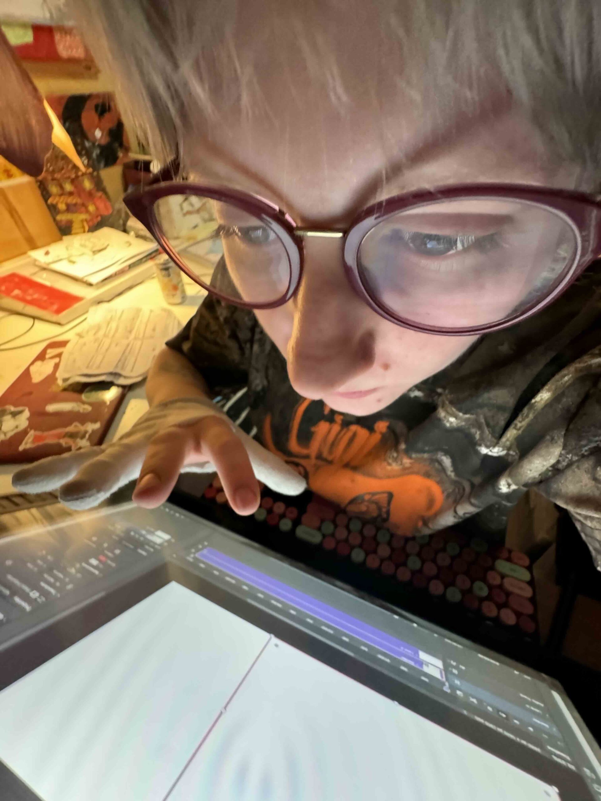
For screenprinted scenes, I prepped and exposed the silk screens, then printed one scene and one color at a time. I scanned the printed sheets at 1200 dpi and hand-aligned them in After Effects. There was very little editing after the alignment because almost every frame of the film was printed, most of the loops had digital pans and zooms that were physically printed. I’ve now got a pretty sizeable filing cabinet drawer filled with the prints from the film, they’re wonderful objects to have. The entire film took about one year, the animation and printing went by pretty quickly. The hand alignment was very tedious, and I’m very grateful for audiobooks.
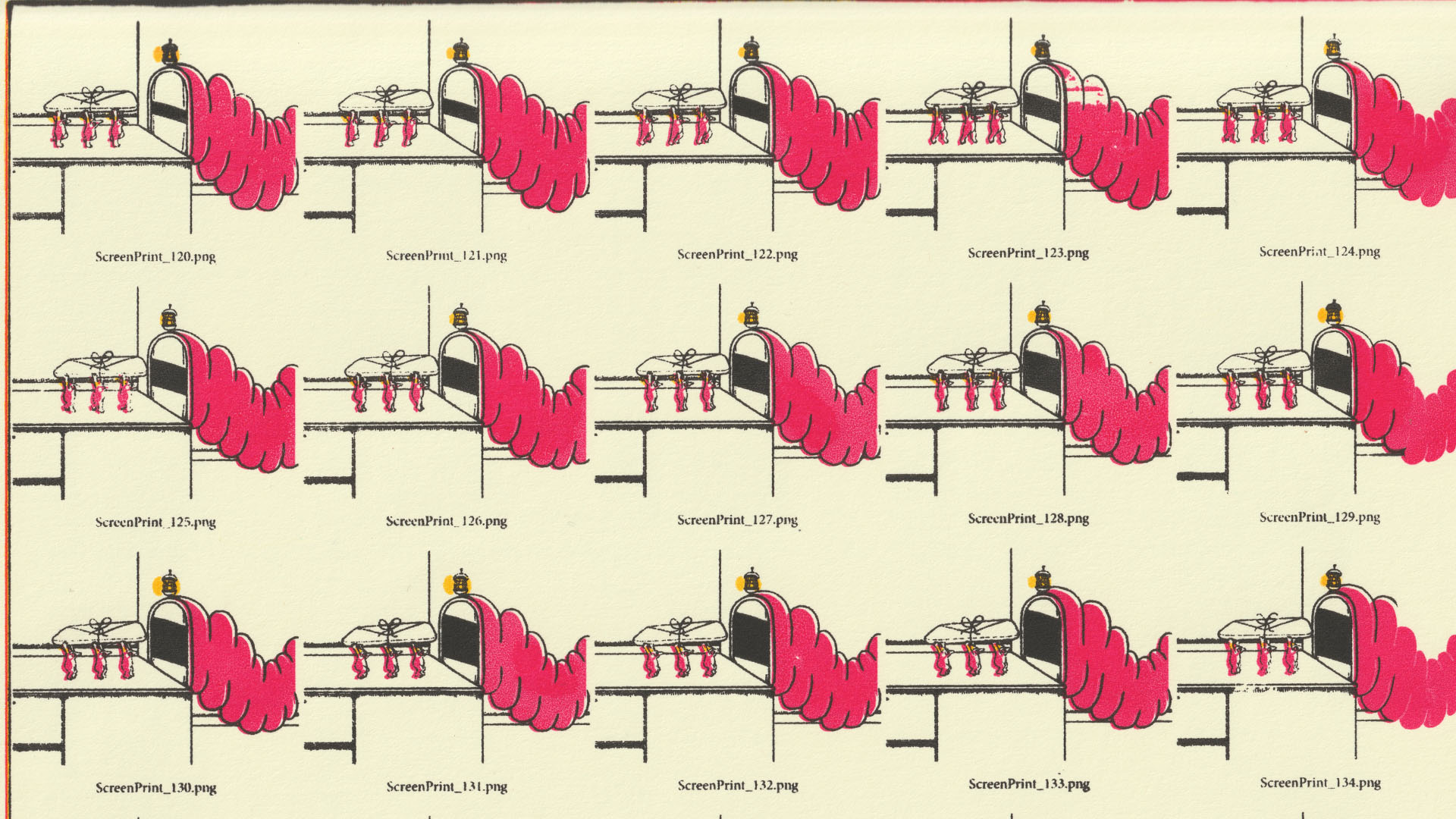
There’s an incredible amount of repetition in the film, both in the movements of the workers and in the machinery they operate. Was that something you were consciously building into the animation and did the repetitive nature of the process affect the way you approached making the film itself?
Yes definitely. I was very intrigued by weaving loops and knew I wanted them to be a large part of the film because they visualized the repetitive nature of factory production methods. Initially, it was also an idea I hoped would save time during printing. I had planned to print the loops and then pan and zoom around them digitally post-printing, but the digital movements looked much better as a pre-printing decision.
It’s a moment that feels large to me, even if it goes unnoticed.
I am a big fan of slowness and meditative qualities in animated films, which the repetition and looping heightened. I also wanted the workers to feel harmonious with the mechanisms within the film, their identities are very connected to the production and products. I tried to do this with their colors, design, and movements. There is one small moment, an idea from my wonderful friend Josh Cloud, where one of the workers falls into the sink, and the film does not stop or acknowledge it. It’s a moment that feels large to me, even if it goes unnoticed, because it nods to the loss of workers’ individuality and rights for convenience within these large systems.
I really love the colour palette of Busy Bodies. How did you arrive at those colours and were there particular ideas or emotions you wanted the palette to evoke? Did the physical process of creating the animation influence the choices you made?
The limited color palette resulted from the printing limitations; I decided to stick to three colors due to printing them separately, which also translated into three objects and mechanisms for the film. I chose yellow for the lemons, green for the fish because trout is my favorite fish, and red for the gloves because it enhanced the bureaucratic feeling of the film’s systems, in my opinion.
I wanted the colors of the film to create a warmth that invites the viewers in, maybe even a bit of nostalgia or familiarity to pair with the strangeness of the world of the film.
The paper was a large and fun decision to make. I loved this paper because it added a really beautiful texture to the entire film, a texture that can’t really be seen on the printed pages in person, but is highlighted because the scans are so scaled up. I love the paper’s tone because it felt like an old document left in a filing cabinet, found decades later with an aged hue.
The color tones are personal favorites of mine, my apartment is filled with earthy greens, reds, and yellows. The film’s topics are very heavy, but the humor in the animation style lightens them. I wanted the colors of the film to create a warmth that invites the viewers in, maybe even a bit of nostalgia or familiarity to pair with the strangeness of the world of the film.
Sound plays an important role in giving the factory its sense of life. How did you approach the sound design and score and what did you want the audio to contribute that the visuals couldn’t?
I’m very particular about sound in my films, I have yet to make a film with spoken dialogue. Some huge sonic inspirations for this film were Raymond Scott and Joe Meek. I worked alongside two wonderful musicians, Arius Ziaee and Alex Edgeworth, who joined me in recording synthesizers for the film at the Vintage Synthesizer Museum in Los Angeles.
I love adding sound that gently nods towards the darker subjects and layers of the film.
Alex introduced me to the musician Ursula Bogner, who became a major reference point for the film’s sound design. I didn’t initially plan to do the sound design myself, but I had a very particular idea for the film’s sound, and my producer, Eric Ackerman, suggested I do it myself because I could see it so clearly in my head. I’m very shy about my musical skills, and I felt incredibly vulnerable making the final score and sound, but it was also very exciting, and I used a lot of strange tools, including vintage synthesizers, clarinet, harmonium, keyboard, water, pillows, lemons, hay, metal sheets, and vacuums.
For me, it feels incredibly important that sound adds a subtle, ominous, and dark tone to my films. My animation style, and animation in general, can be seen as quite cute and as a medium intended for children. I love adding sound that gently nods towards the darker subjects and layers of the film.
Towards the end of Busy Bodies, the complexity of the production seems to collapse, with the film reducing this production process down to its constituent parts. Was that shift something you always had in mind? What did you want that change in aesthetic to leave us thinking about?
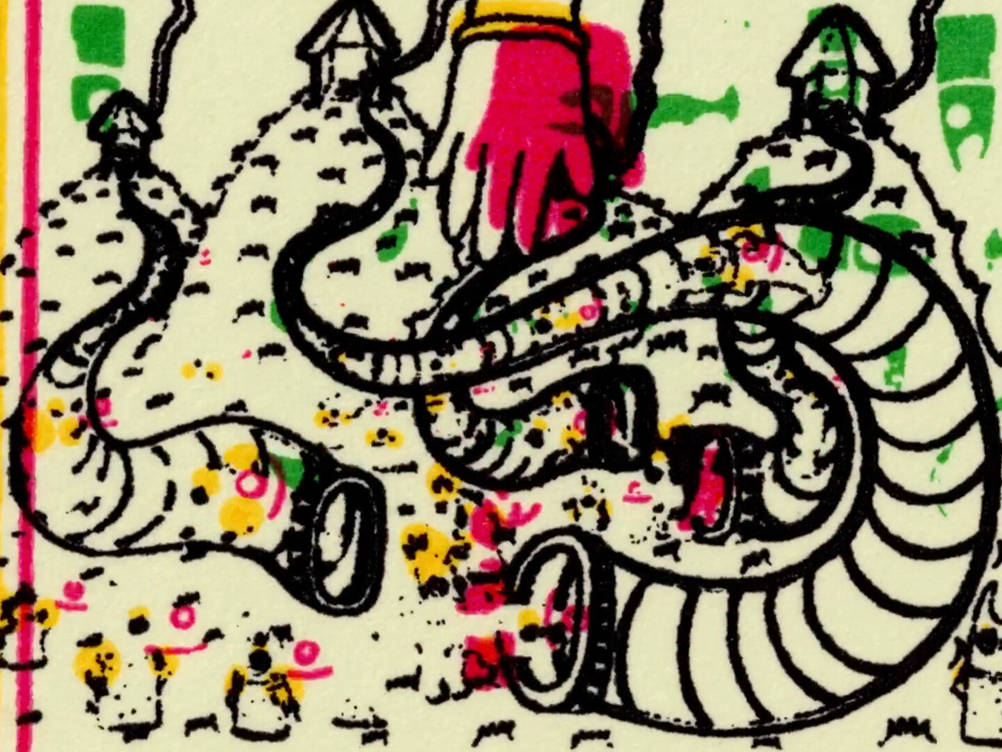
The film’s ending was an unexpected result of the printing process. As I said before, the shift in printing styles resulted from budget and timing restraints, but it became a pivotal narrative point. The final ending, where the cycles repeat as the different color layers are peeled away, was also a discovery that came from the printing process. It feels so obvious now, but I didn’t initially think to include the screen-printing element of separate color passes.
Originally, the film kept looping with all the colors, but it was incredibly boring. For me, peeling the layers away is a metaphor for the importance of hidden elements within mass production. There’s a lot of questionable ethics and darkness in our mass-production systems, and I believe (and hope) that the more we uncover, the more our systems are questioned and begin to break down and evolve.
Busy Bodies is quite a surreal story and your previous work also seems to embrace abstract narratives, so I’m interested in what draws you towards this kind of storytelling. What can you communicate through this approach that you feel would be harder to achieve through a more conventional narrative?
I’m a personal fan of abstract narratives, and I’m a huge fan of magical realism. Some of my favorite books are The Third Policeman, The Hearing Trumpet, and The Master and Margarita. I’m deeply interested in abstract subjects and surreal narratives, and I think animation lends itself so perfectly because it is a completely unlimited medium, truly, anything can be created.
Even if I tried to create a film that would be seen as a very conventional narrative, it would still be just as abstract as my other films.
I also think it’s much more fun to leave room for interpretation and add layers of abstraction that let my films be viewed on different levels. To me, my films are pretty conventional narratives. When I start a film, I have a clear, simple plotline that grounds my process. I think even if I tried to create a film that would be seen as a very conventional narrative, it would still be just as abstract as my other films.
Thanks so much for joining us and sharing Busy Bodies with us, Kate. Before we wrap up, do you have any other projects you’re currently working on that you can tell us about?
Yes! I’m currently working on a new short film, deeply inspired by my grandparents’ stories of growing up with 10-12 siblings and my experience of growing up in a very small family and pretty self-secluded in my bedroom. The film loosely follows someone desperately trying to sleep, unsure whether the interruptions come from reality or the world of their dreams. I’m planning to return to hand-painted cel animation and multiplane animation. I’m very excited to work on the film during my fellowship at MacDowell this winter.
And finally, this is a question we ask all our featured filmmakers: what’s one short film by another filmmaker that you’d recommend to the Directors Notes audience and why?
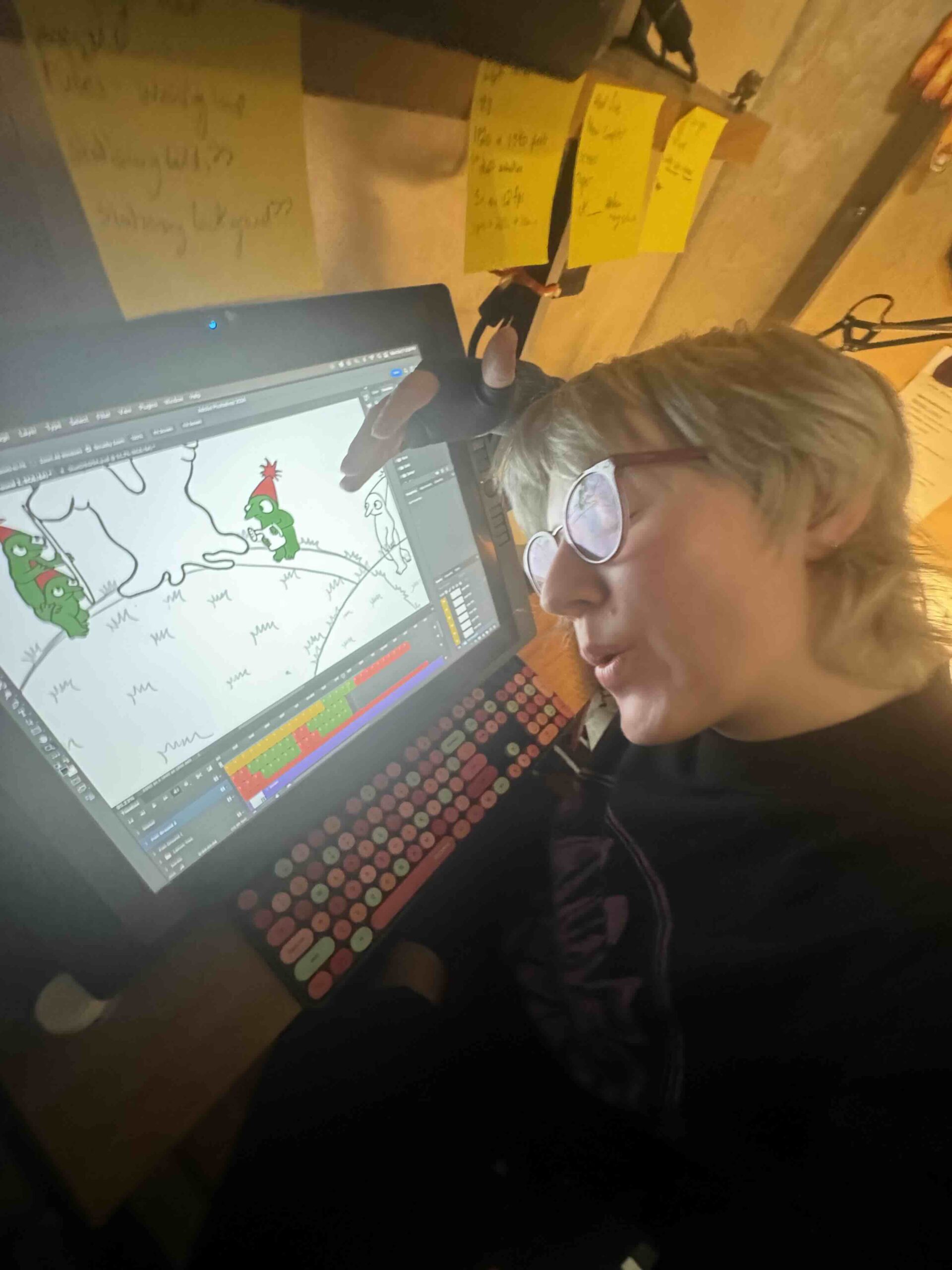
Ah, this last question is so hard. However, the film I want to recommend—although it’s not released yet—because it’s wonderful, and because I worked on it while working on Busy Bodies (and vice versa). The film is Lil Gibbos by Arius Ziaee. While Arius animated Lil Gibbos, they also colored Busy Bodies. While I edited Busy Bodies, I also animated the background characters in Lil Gibbos. Arius is a huge inspiration to me, and I’m very grateful we get to keep working on each other’s films.