
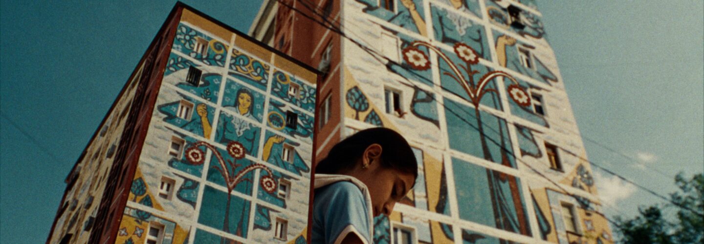

It will forever be a pleasure to welcome back filmmakers whose work we have seen flourish over time, and since his first interview on Directors Notes in 2018, Lado Kvataniya has continued to astound us here at DN with his constantly evolving, deeply resonant storytelling. His latest film, Haqqim Bor (I Have the Right), commissioned by Uzbekistan’s National Agency for Social Protection, is no exception. Kvataniya is no stranger to confronting difficult subjects, as seen in his 2025 WeAreDN Award-winning film Gun, and once again, he delivers a work that lingers long after the screen fades to black. Haqqim Bor presents an unsettling yet mesmerising image: children trudging forward with miniature buildings strapped to their backs—schools, homes, kindergartens—each one a meticulously crafted prison of memory. These structures are not just metaphors but physical manifestations of trauma, literalised in a way that refuses abstraction. In Haqqim Bor Kvataniya makes the invisible palpable, steeped in horror—not supernatural but societal—more terrifyingly embedded in the architecture of everyday life. Haqqim Bor refuses to aestheticise suffering at a safe distance. Kvataniya’s visual language—warm, saturated tones contrasting with the film’s harrowing core—mirrors the dissonance of a world that looks away from children’s pain. There is no darkness to hide in, no shadows to obscure the truth. Kvataniya’s work has always thrived in the intersection of artistry and urgency and Haqqim Bor is perhaps his most potent distillation yet. By rendering trauma in such concrete, surreal terms, he forces the audience into confrontation—not with monsters, but with the systems and silences that allow harm to persist. As Kvataniya returns to share this important work with us, we spoke about his rejection of direct, didactic storytelling about abuse, instead looking to horror, using beauty to disarm the audience and his striking visual metaphor of backpack-houses.
How did Haqqim Bor come into being?
When the agency approached me, they explained that the project dealt with a very urgent and complex subject, and they needed an artistic solution for it. The challenge with such social projects is that if you speak too directly, the audience often understands what it’s about within the first few seconds—and instantly shut down. So, the goal was to create a piece where the social issue wouldn’t be obvious on the surface, but instead revealed only at the end, along with the full scope of the problem and the meaning behind it.
We decided to position the work as a short film, using it as a disguise for a deeply painful subject. I chose the horror genre because it allows you to build tension and atmosphere, guiding the viewer through a specific emotional journey—so that, in the end, the true nature and message of the film comes as a revelation. The brief was very open: there was no ready-made script. All I had were the key subjects and real-life cases of abuse survivors, on which the stories had to be based on. Everything else was complete creative freedom—something I was deeply grateful for, as there were no rigid limits or restrictions.
How did you decide on what cases to spotlight?
The film portrays horrifying cases—but we all know there are far more in reality. This was one of the key requirements from the agency: we had to focus on the most high-profile, statistically significant cases—the ones that happen most often in the country. Sadly, there are far too many. The agency provided us with statistics, and we conducted our own research. It was an incredibly heavy and emotionally draining process—a deep dive into the darkest sides of human nature, a kind of descent into hell. We studied not only real data, but also materials available online, and through news reports we tried to understand the victims’ context: their social background, and the reasons behind these horrific events, especially those involving children. As a result, combining the agency’s statistics with our in-depth analysis of specific cases, we identified three main themes—three patterns that, unfortunately, occur most often.

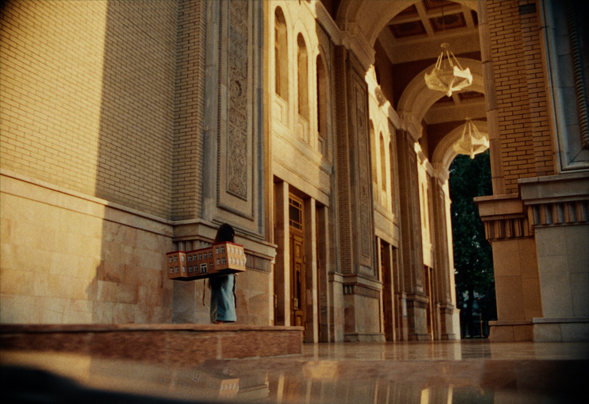
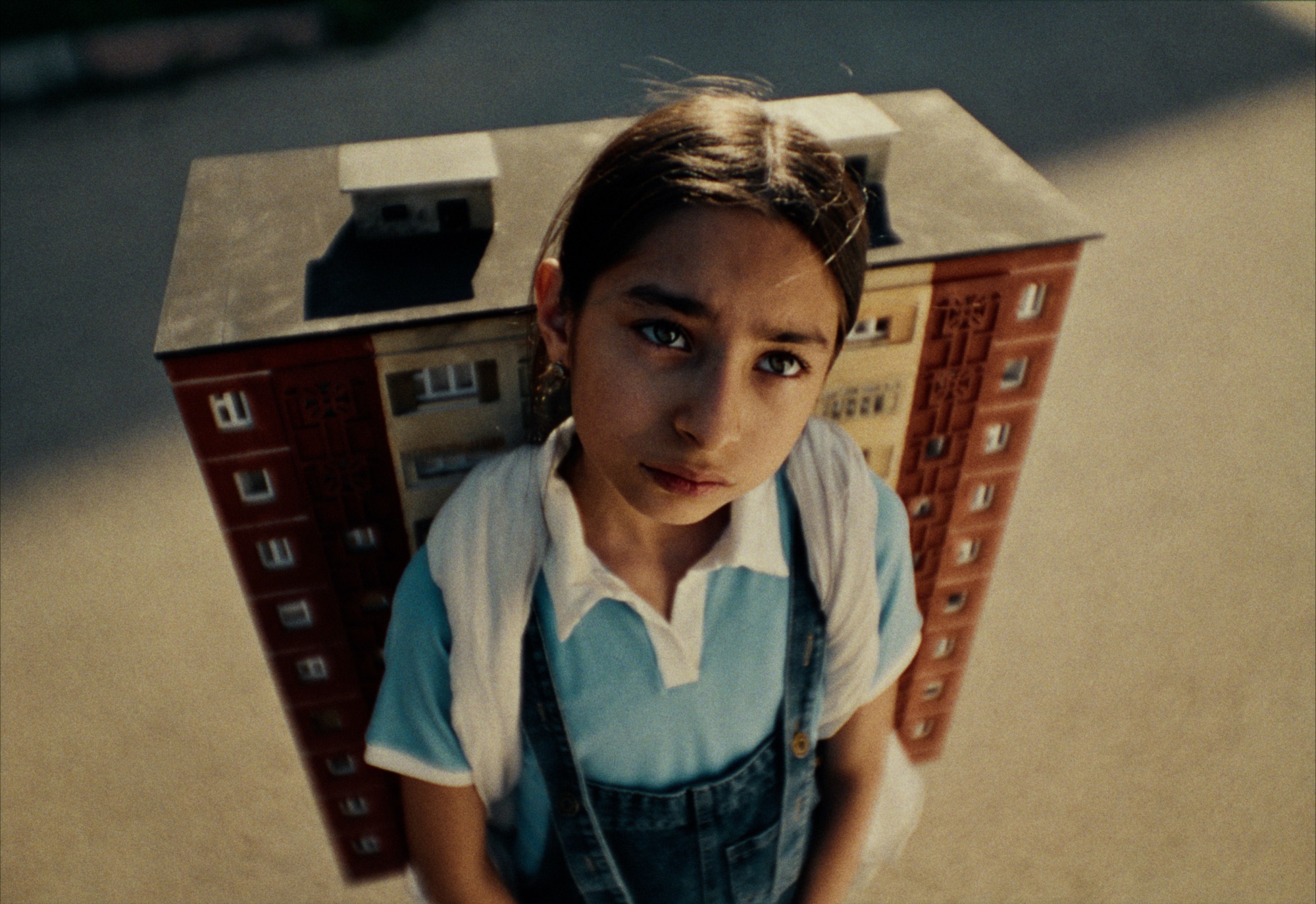
Spaces meant to be safe turn into traps a child carries forever—like a snail and its shell.
Where did your potent visual motif of the children carrying their trauma originate from?
I began to think about trauma as having a shape. For a child—especially when it’s connected to abuse in social institutions—that shape can be transformed into an image. That’s when I realized: trauma becomes part of the child’s body, something they live with every day. They literally carry it on themselves. And even when others see it, they choose to look away. The child is left alone with their horror, fear, loneliness, and pain, not knowing how to live with it. What’s more, countless adults continue to carry these same backpacks—traumas that have, over time, fused with their bodies. It’s like a snail’s shell or an armor woven from pain and suffering, becoming an extension of the person, something they move through life with.
Most Popular
This film is not about monsters. But there are monsters in it. They don’t hide in the dark—they live among us. This is a film about adults—and for adults. About those who commit, enable, or conceal violence against children. I want the audience to go through this experience. Not to observe it from a safe distance, but to feel it—to confront the scale of a child’s pain, the depth of their loneliness and fear.
Trauma doesn’t fade. It doesn’t disappear with time. It grows into the body and becomes part of the way a child walks, breathes, and looks. It lives in places: a classroom, a hallway, a bedroom. Spaces meant to be safe turn into traps a child carries forever—like a snail and its shell. That’s why I speak the language of horror. Because horror lets us get close to what feels unbearable. The fear in this story is distorted, surreal, magnified—because a child’s mind doesn’t understand pain, it amplifies it. This film is an attempt to make the invisible visible. To force adults to see what they’ve chosen not to see. To hear what they’ve refused to listen to. To understand: silence is a form of violence too.

I’d love to dig into the creation of these truly stunning, replica houses. What was the process like in terms of building them especially as you only had two weeks to prepare?
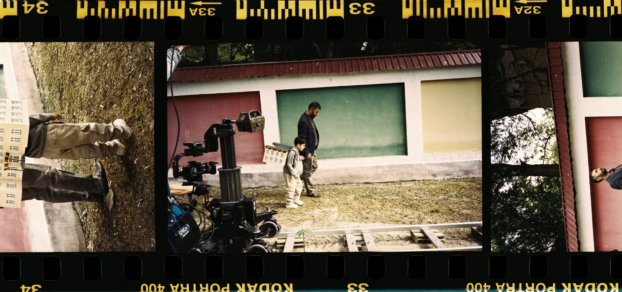
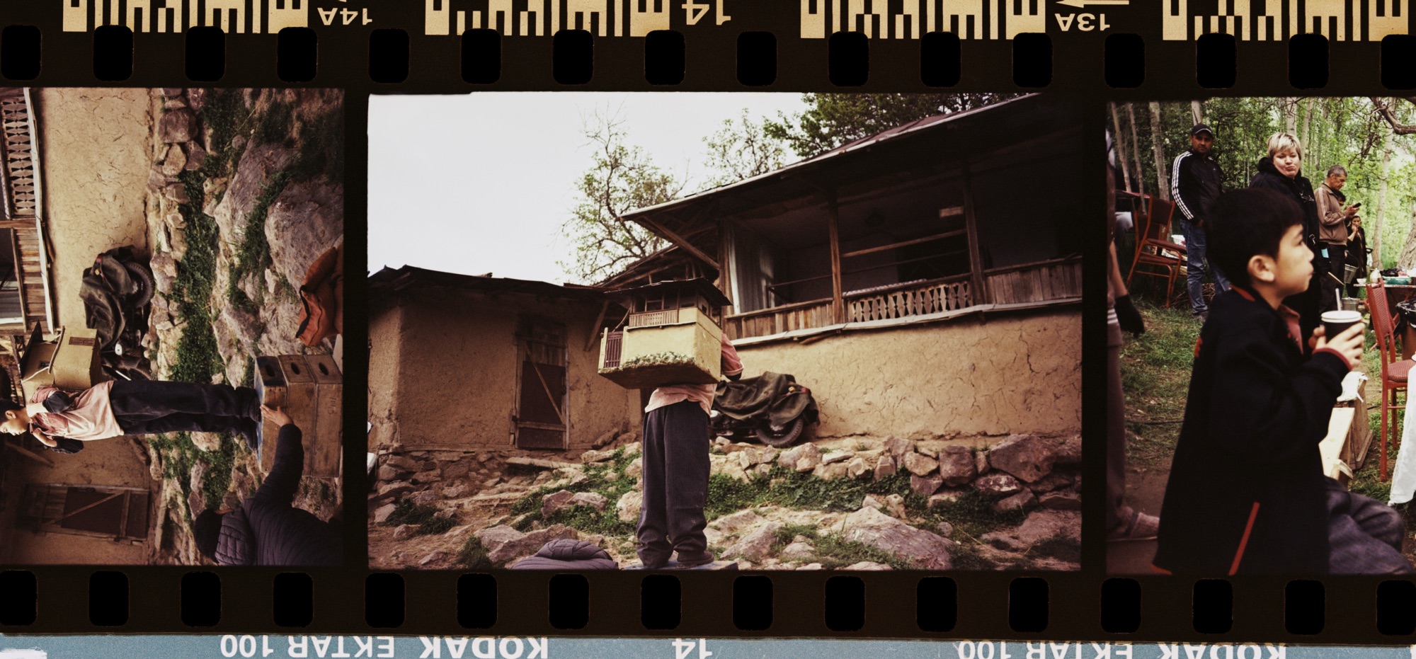
The creation of our buildings and their scale models was led by our production designer Alexey Yandovskiy. His main goal was to capture the expressive, recognizable architecture of Tashkent—that distinct Soviet-era style that could serve as a visual marker for such buildings. The city has a vast legacy of Soviet architecture, and it was important for us to choose structures that were both universal and instantly recognizable. After all, in our film, the house itself becomes the space where the violence unfolds.
In the end, we created three distinct socio-spatial contexts, each with its own unique architectural identity.
We carefully developed the aesthetics of three types of social environments. The first was a typical residential building or apartment within the city—a place where abuse could take place. The second was a social institution. Through research and statistical analysis, we discovered that a significant share of child abuse cases occur in kindergartens, which made this type of setting a key focus for us. The third was an out-of-town location—villages and rural settlements where tragedies also occur. In the end, we created three distinct socio-spatial contexts, each with its own unique architectural identity, yet united by a common aesthetic shaped by Uzbekistan’s architectural heritage and cultural code.
It’s also worth noting that our production designer has a degree in architecture, so the task came naturally to him. He has a deep understanding of stylistic and architectural trends, especially from the Soviet period. The experience and skills he developed over the years—including his student days, when he often created scale models for his projects—allowed him to apply the same model-making techniques in our film. And I must mention our painters—incredibly talented artists who worked day and night, hand-painting the buildings. This was not printed or machine-made—every detail, every pattern, every sketch, every mosaic was done by hand! This approach gave the sets a special vibrancy and authenticity.

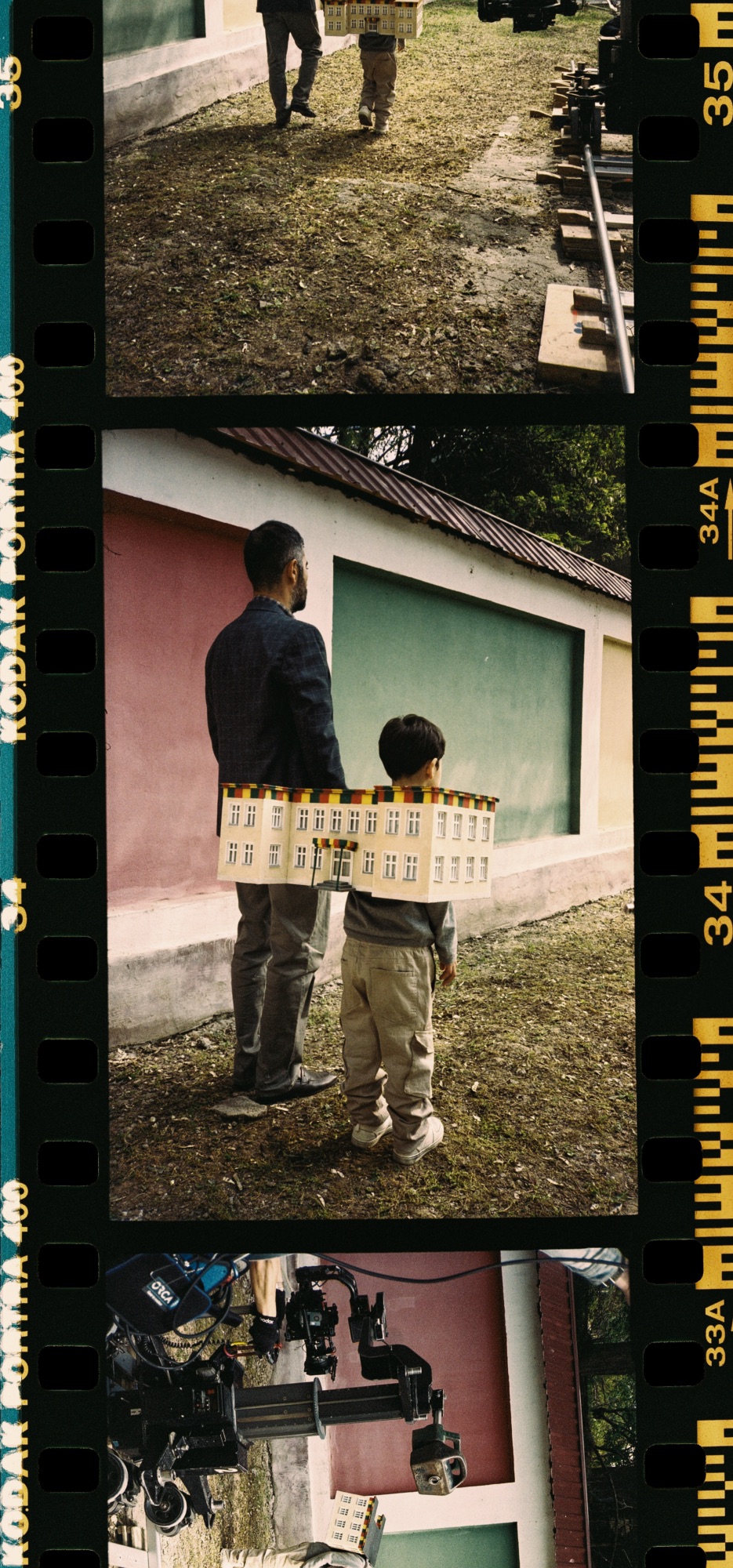


Despite the incredibly heavy subject and your lean into horror, the colours and tone of the film have a surprising warmth to them.
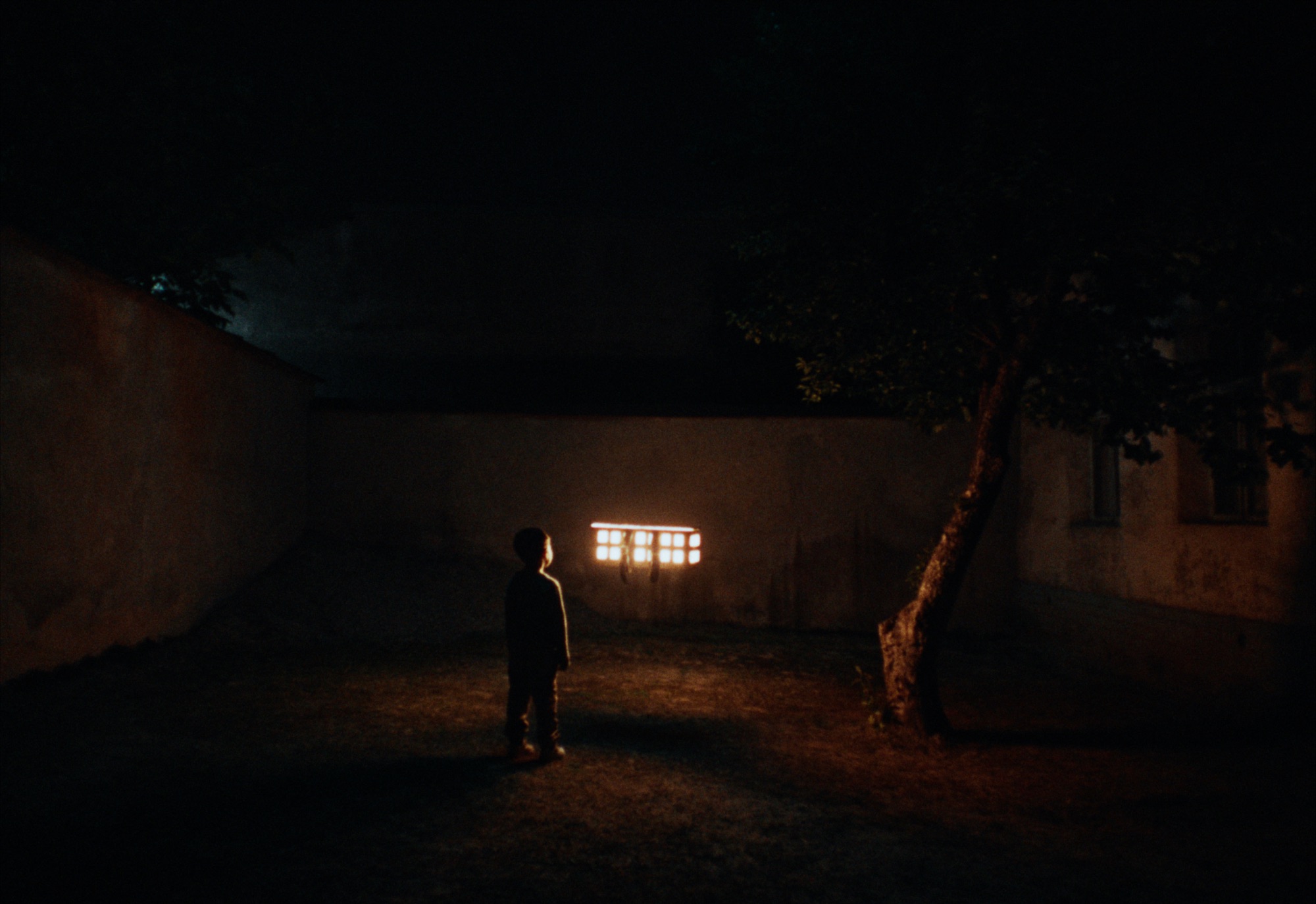
I wanted to move away from the typical visual approach used in social projects—the dark tones that instantly signal to the audience that they’re about to see something depressing, colorless, and lifeless. Instead, I wanted to build everything on counterpoint and contrast. Despite the cruelty and horror of the subject, it was important for me to find a distinct aesthetic—to create a false sense that the viewer is watching a horror film, yet one filled with vivid, saturated colors and striking contrasts. The visual layer would remain separate from the story’s context—and in doing so, it would actually amplify it, lifting the emotional impact to a new level.
This became a key creative decision. We all know what typical social ads look like: muted colors, heavy lighting, and the immediate thought—this is going to be sad. I didn’t want to prepare the audience for something terrible, but to lead them into a visual and aesthetic trap. To guide them along a certain path, and only in the end deliver a strong, painful emotional blow. Because that’s exactly the journey I went through myself.
I didn’t want to prepare the audience for something terrible, but to lead them into a visual and aesthetic trap.
We know these problems exist, but unless we’ve faced them personally or studied them deeply, we tend to keep our distance. For any normal person, this is painful—and that’s why I believe that using a bright, aesthetic visual style helps draw more viewers in, carry them through the story, and strike at that very nerve. So that the issue is heard loudly. And so that those who have been witnesses—or sadly, victims—can take a step forward and reach out to a helpline.
The foreboding score certainly guides us more classically into the tone and the foreboding register hits you on a visceral level.
Working with the music and atmosphere was challenging, because on one hand, there are the boundaries of the genre and its inherent musical narrative—a sense of tension and suspense. I wanted the audience to perhaps not fully understand the imagery until the very end, when everything would fall into place. But until that moment, it was important for me to convey, through music, what the child is experiencing—that same constant level of tension, that reflection of their emotional state.
Here, music isn’t just a tool for creating suspense—it’s primarily a way to express the emotional state of each character. There’s an overarching theme of a child’s fear that runs through the entire film, and there’s also a theme of hope. The latter turned out to be the most difficult: at one point, we felt we were drifting too far into overly sentimental or emotionally heavy territory. We needed to find a balance so that, in the finale, the audience could feel both hope and the darkness the children are fighting against.
I was particularly wary of piano or orchestral parts that force the tears out of the viewer. We tried that route, realized it felt too manipulative, and went back to searching. We made many attempts, shared versions with friends, debated, and stripped away the excess. I generally dislike working with strict references—especially in projects like this—so with the composer, we preferred to experiment along the way rather than follow a pre-set template.

We made a conscious effort to ensure the project was shared and promoted primarily through respected and influential voices in the country.
The impact of Haqqim Bor needs to be felt, how have you been sharing it with audiences?
We’ve had public screenings. We had a premiere where we invited a large number of bloggers and influencers to help spread the word about the film. In parallel, the film was released on YouTube, and of course, a helpline was launched. It was important that everyone we invited shared the helpline’s phone number people can call if they have been victims or witnesses of violence. The premiere was dedicated to exactly that—raising awareness about the helpline and making it clear that this issue is being addressed openly in society, despite how painful it is. We made a conscious effort to ensure the project was shared and promoted primarily through respected and influential voices in the country. This approach allowed us to significantly increase reach and draw more attention to the problem.
Given your prolific output, what new projects will we see from you in the future?
As always, I’m working on several projects in parallel—both large and small, commercial and non-commercial. For me, the priority is always the content, the meaning a project carries, or the challenge it presents. This has nothing to do with the size of the budget. I’m drawn to stories that deal with urgent topics or present unconventional challenges. Right now, I have a number of different ideas in development at various stages, so I believe there will be more premieres in the near future. Thank you.